Streamlining CANCEL
A Design Case Study
In the inside, there are hundreds of systems that work together in tandem to make your next journey truly remarkable and memorable. Few taps on the app and you are booked!
But, if the traveler wants to make any changes to the booking, the experience was complex, effortful and not optimal.
I was part of the project which was bringing a shift within the company to become more customer-centric and redesign Expedia’s after-sales experience to give our travelers an end-to-end effortless experience.
Founded as a division of Microsoft in October 1996, Expedia acquired a lot of companies during the course of years. As I write this case study, there are 21 brands under the Expedia Group umbrella. With all these acquisitions, comes a mammoth task of creating consistent experiences.
To top it off, the majority of the company’s focus had been on sales. From a customer service standpoint, we were falling behind on giving an effortless experience. And by service I mean when there is a hiccup before, during or after your trip and you might need some help. Yes, shit happens!
We were shipping our seams in these experiences and most of the time, the feature didn’t even exist online.
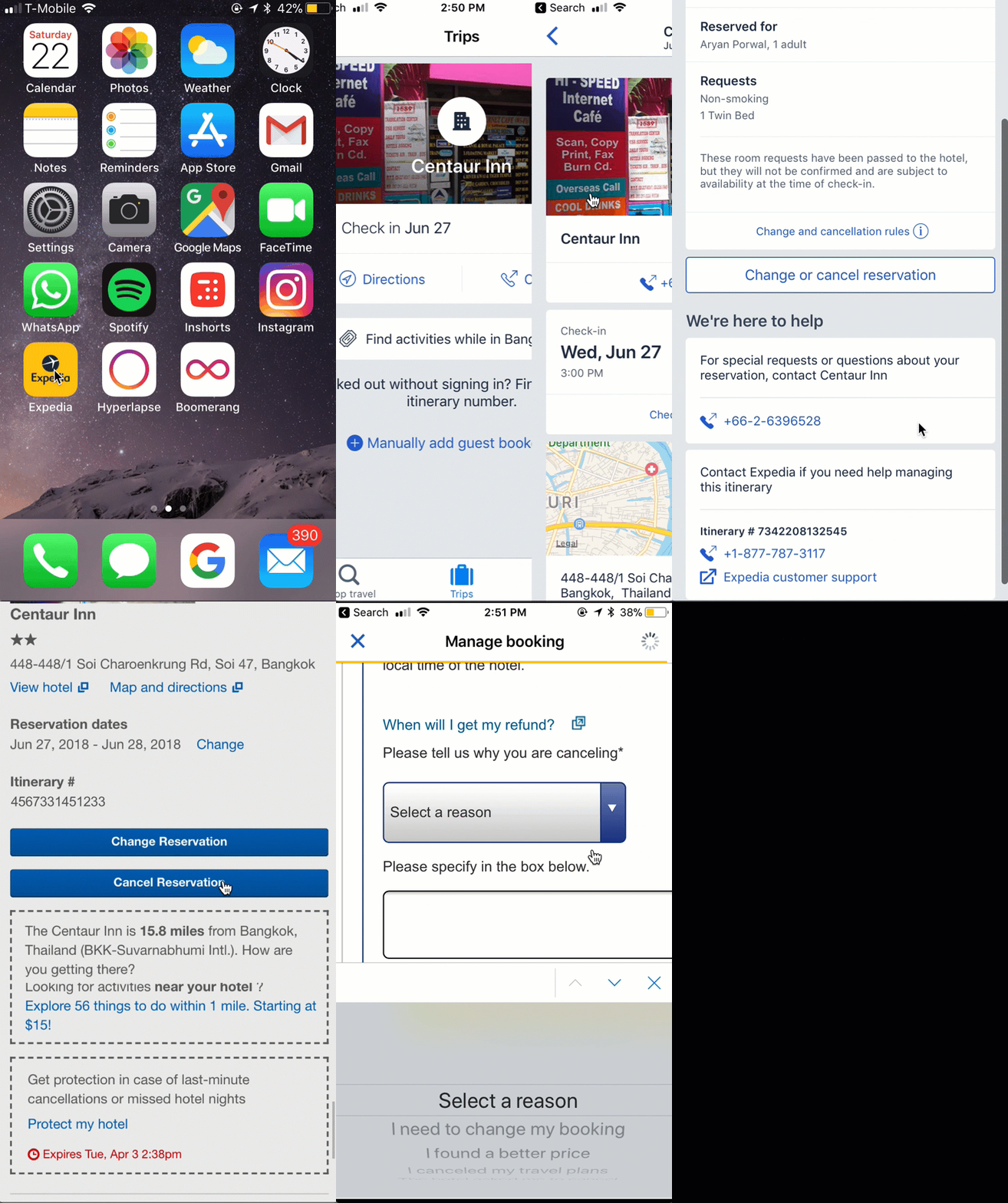
REFUNDABLE BOOKINGS
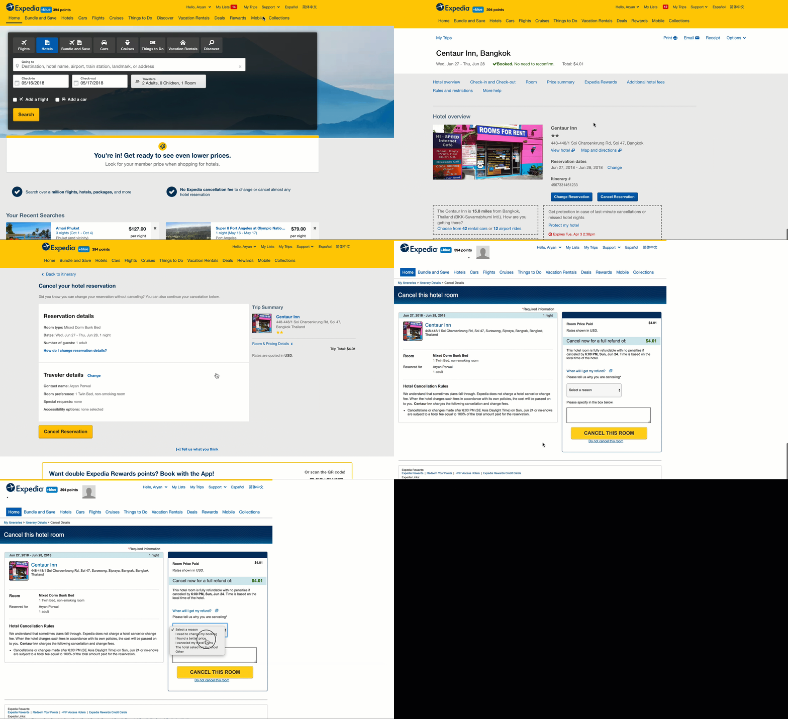
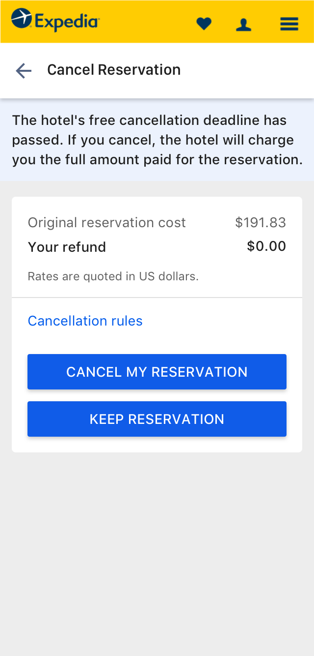
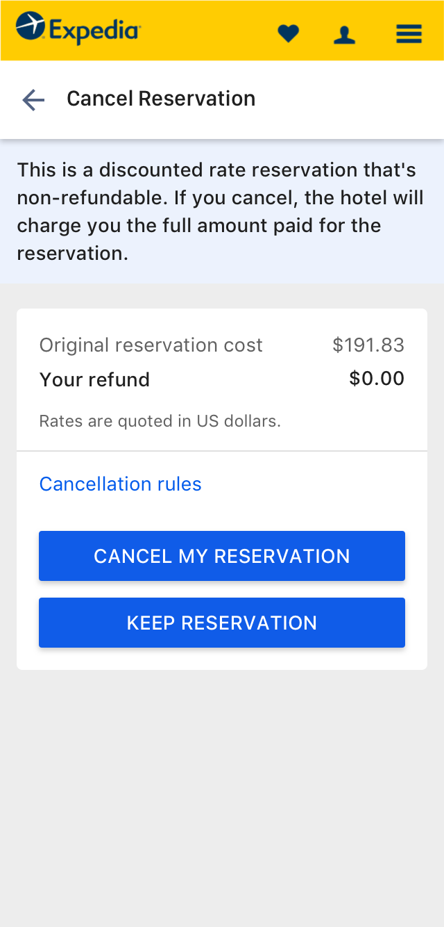
User can cancel a refundable booking online but the experience is not that optimal. The experience hasn't been redesigned in a while and there were multiple steps in the flow. Some of the pages were not even responsive.
INSIDE PENALTY BOOKING
For canceling an inside penalty booking, there was no self-service option available online. The user needs to contact customer support for any changes or cancelations.
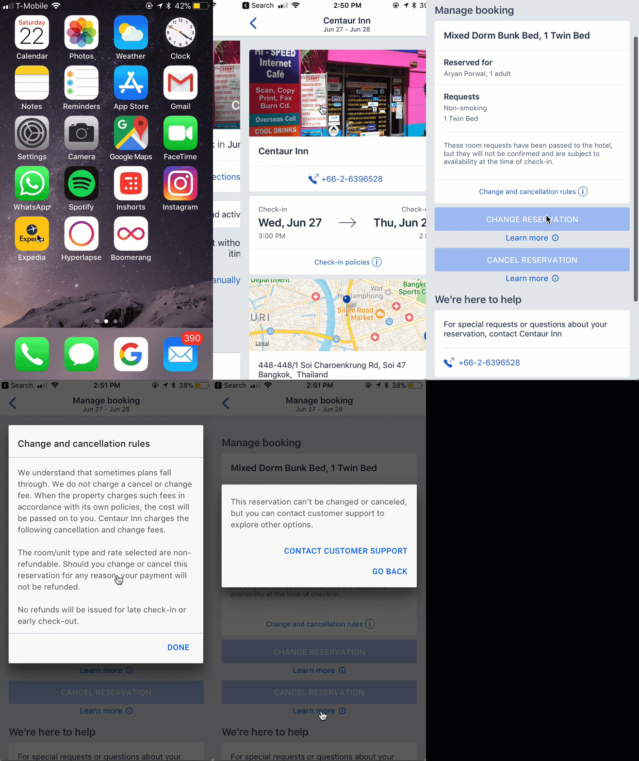
The Challenge
Bring a shift in the company
Our goal was to give a consistent experience before and after the purchase. But, we realized pretty early that we can’t boil the ocean at once. So, the project focused on streamlining the cancel experience which is one of the many journeys a traveler can take after booking a trip.
High-level goals were to:
- Increase the self-service capability online on one brand – Expedia.com
- Bring flexibility to rules and policies.
- Make it fast and easy to cancel a trip.
- Give travelers more visibility into the process.
- Create a platform for innovation and deeper engagement.
My Role
I led the design of the cancel experience in 3 phases and collaborated with 2 other designers in Phase 2 and 1 other designer in Phase 3. In addition, I worked with 2 Researchers, 3 Content Strategists, 4 Product Managers, and 3 Teams to design the complete experience.
Kickoff
Understanding the space
I had very little to no idea of the existing cancel experience on expedia.com. I was curious to know and understand how it performs against the rest of Expedia Group’s brands and also against competitors.
In addition to booking and canceling tens of reservations in the test environment, I started finding if any research studies were done in the past. Stumbled across a benchmarking study carried out by Andy Tonkin (Strategist) in partnership with Yuan Zhuang (Researcher).
Benchmarking Study
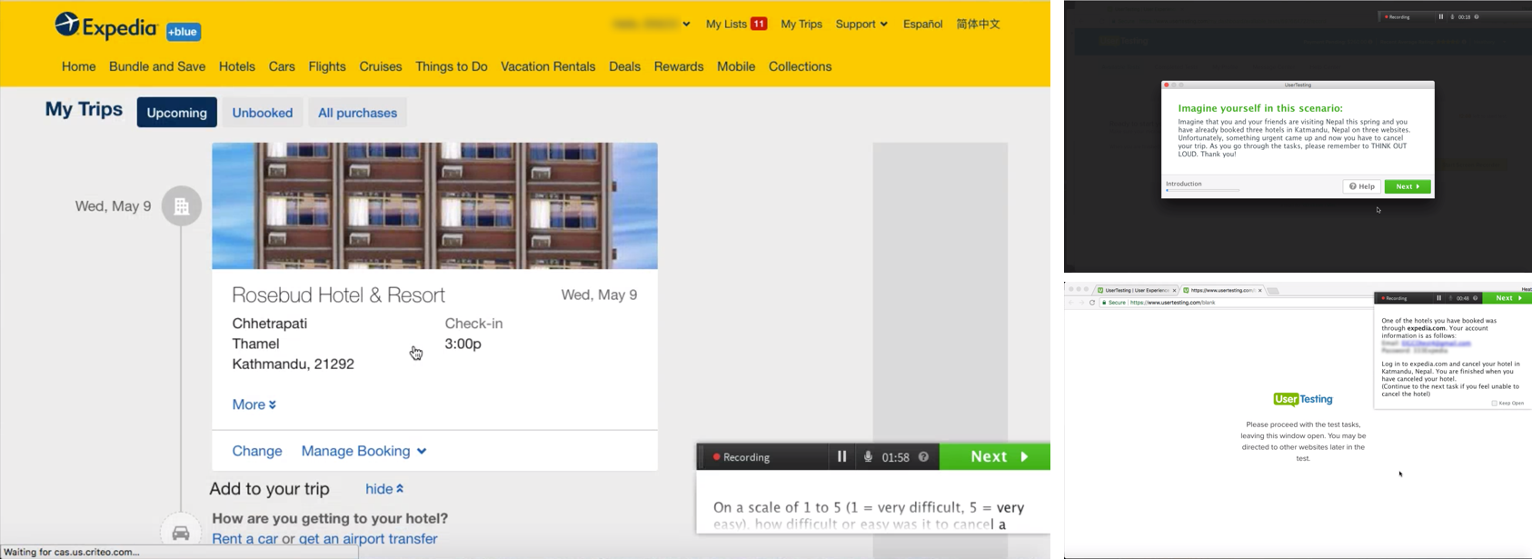
From Feb to Mar 2018, a remote unmoderated study was conducted to gain competitive intelligence on select OTAs (Online Travel Agencies) and hotel suppliers in the US.
29 total users went through the cancellation process of three sites (in random order). Half of the users were tasked with non-refundable cancellations and the other half went through refundable cancellations on a total 6 brands (Expedia, Orbitz, Hotels.com and 3 other OTAs/hotel suppliers).
The goal was to gain a qualitative understanding of how other brands self-service experiences compared (effort and likeliness to recommend) in two of the most common user journeys: cancel in-penalty (non-refundable) and cancel outside penalty (refundable) for lodging purchases.
Insights from the study
Brand A and Hotels.com were top performers relative to effort and likeliness to recommend (NPS). Expedia and Orbitz drastically underperformed their peers in all categories.
I have intentionally hidden confidential data here.
Primary reasons for the disparity include:
- Brand A and Hotels.com provided an experience that was “simple,” “straightforward,” and granted users a sense of understanding and control regardless of the journey.
- In non-refundable cancellation journeys, neither Expedia nor Orbitz provided a path to self-service resolution, creating confusion and frustration among users.
- In refundable cancellation journeys, Expedia and Orbitz had unclear information regarding the cancellation process and required multiple steps to resolution.
The Discovery
Simple, straightforward, and minimal effort is what works best.
When users have the intent to cancel, they will cancel. Providing more steps, nested buttons and unclear information does not make the Traveler reconsider canceling; it only makes things more difficult for the traveler, reduces trust, and in turn, reduces loyalty.
Humans are a curious species, if we are not allowed to complete an action, we want to know at least what’s the reason behind it. From a business standpoint, I can understand being an insider, that some processes are very complex and might require a person to negotiate with the supplier, but hiding the option and not allowing a user to complete an action online creates more confusion and frustration.
Deeper Insights
The discovery was not over yet but it was just the beginning. Before I could start designing, it was important to understand the end-to-end system.
I began digging more and tracing the actual customer journey for a non-refundable or inside penalty booking. As a traveler, you can book a non-refundable booking right off the bat or booking can enter penalty window based on timing. Both of these options are clearly communicated while making the purchase as shown in the below screenshot.
Screenshot showing cancelation policy clearly shown on Expedia.com while booking a room
In an inside penalty situation, Expedia doesn’t charge any cancellation or change fees. When the property charges such fees in accordance with its own policies, the cost is passed on to the Traveler.
In the post-purchase experience, since there was no option available to cancel the inside penalty reservations online, I was curious to know how would a traveler cancel the booking.
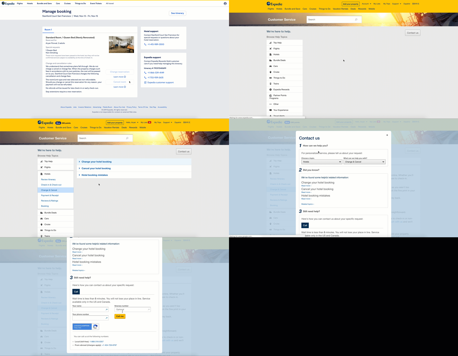
Apparently, the only way booking can be canceled is by calling the customer care number and talking to a representative. But it wasn’t as easy as clicking a link and making a call. The user is redirected to the support page to find the right phone number.
This shows the experience to make a phone call to the customer care for an inside penalty booking.
While talking to an agent, you can request a waiver of the cancellation fee or the agent can recommend it based on the reason for cancellation which can be anything ranging from ‘change of plans’ to ‘I broke my leg’. Which will then kick start the ‘Requesting a waiver process’.
Waiver Request Process
- Agent puts the customer on hold and calls the hotel to request a fee waiver.
- The conversation can range from a few seconds to minutes or days depending on whether the agent is able to get hold of the right person (an approver).
- If the approver is unavailable (off-hours contact)
- The case is labeled as ‘approver not available’
- Customer is told the situation and assured that we’ll follow-up and let them know
- The Agent tries two more times as per SLA
- Informs the customer about the decision - If the approver is available
- The Agent informs the customer about the hotel’s decision.
- If approved, booking is canceled and a refund is issued after documenting the details of the approver.
- If denied, the agent can cancel with a penalty or the customer can choose to keep the booking as-is.
Waiver request process
Pretty long and effortful, isn’t it? That’s exactly how our agents, hotel partners, and Travelers were feeling about this process.
Researching with agents – Most waiver requests required additional steps or effort.
To gain more insights we planned second research with agents in a contact center and flew to El Salvador, San Salvador to conduct in-context side-by-side studies.
Sitting with agents, listening to calls and observe their day-to-day activities and manual work was painful. There were many steps and manual documentation in the process. The agents were trying their best to help the customers but the process was coming in the way and making it difficult for them to be truly customer-centric.
Research studies in the contact center. Tried to take a call myself which was nerve-wracking.
“Over 2.8 million waiver requests were being handled in a year”
The time and energy spent during these cancellations were having a material impact on the business bottom line. Long phone calls with hotels translate directly into longer wait times for other customers in the queue and every phone call increases the operation and resourcing cost.
We were handling 2.8 million annual waiver requests which were costly, time-intensive and did not provide an effortless experience for the traveler, agent, or the hotel partner.
Connecting the dots
I partnered with the Product Manager to investigate the experience of the third user in this journey - our hotel partners and came across some interesting insights.
The hotel partners hated the existing experience and were fed up of the sheer number of calls our agents were making out to them. There was the same material impact on their business too – more phone calls → longer wait times and an increase in the operation & resourcing cost. It became clear that it is also necessary to improve supplier relationships with this effort by severely reducing calls to them and looking for opportunities to automate the process.
Reframing the Problem
Traveler’s intent to cancel had a dominos effect and was causing downstream problems.
Research exercises allowed us to identify the extended users we should be designing for - Agents and Hotel Partners in addition to the Travelers. It also helped us to uncover the downstream problems of inefficient processes, confusing information and unclear instructions which were leading to more effort, frustration and wasted time.
“How might we streamline the cancel experience for our customers, agents, and partners?”
Introducing Redesigned Cancel
Automating the process
Where everything demands effort, Expedia makes the cancel experience effortless by creating an easy, transparent, understandable and fast process. We timely inform you in ways that are understandable and actionable to empower you with the right information so that you can make informed decisions for your next trip.
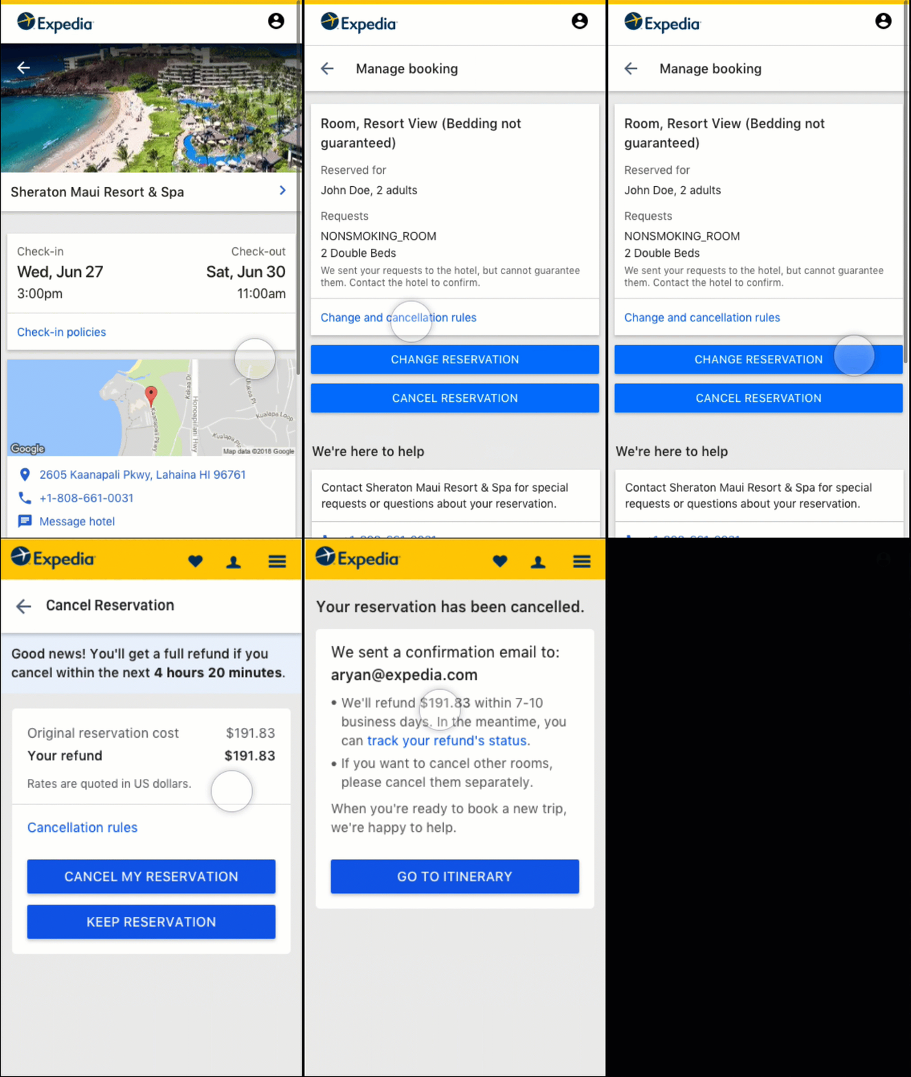
Redesigned Cancel
Be prepared for the situation
Expedia understands that sometimes plans fall through and works with the hotel partners in advance which saves you time, money and effort.
Inform and be transparent
Expedia informs you about the cancellation rules in an easy and understandable way. People-friendly instructions help you better understand, identify your situation and make informed decisions. No more nonsensical industry jargon, extra steps, nested buttons, and unclear information.
Just request and we do the rest
Expedia advocates on your behalf based on who you are, what your situation is and how it impacts you. The process is also automated which removes ambiguity, unnecessary delays and also keeps you informed.
We've got your back
Sometimes there’s a faster way, that requires contacting and talking to an agent. Expedia understands these situations and gives you options to expedite and help.
Flexibility and the final say
Sometimes efforts don’t work out. Expedia arms you with all the necessary information and gives you complete control.
How we got there
Streamlined cancel for everyone
It was pretty evident that designing an optimal experience on just the Traveler side will not solve the larger problem.
Three primary questions bubbled up to form a design strategy:
- How do you design for everyone?
- What contexts need to be considered?
- What’s the most optimal cancel experience?
Working Backwards from the North Star
I started ideating around what is the most optimal cancel experience we can imagine and also talked about the future that sparked creativity. Four key design challenges emerged:
- How might we better adapt to the dynamic nature of a traveler’s life events?
- How might we reduce steps to minimize frustration and increase self-service capability?
- How might we form an optimized cancellation fee waiver request process that minimizes effort and saves time?
- How might we remove the need to contact an agent and hotel partner entirely?
Chalking out the plan
I worked on the roadmap of the project in collaboration with the Product Manager and targeted Expedia.com US (point of sale) to adopt the first slice of this functionality and depending on the results, extend it to the other brands and points of sale. We broke down the project into 3 phases with specific goals to solve the four design challenges which emerged earlier.
Phase 1
Laying the groundwork of automated fee waivers. Working with hotel partners to enable automated waivers on the customer care agents' side.
Phase 2
Using the laid foundation to enable the automated fee waivers on traveler’s side. Also, improve the existing experience for refundable bookings and enabling non-refundable cancellations online.
Phase 3
Creating a new optimized process for requesting a waiver for travelers.
Phase 1
Laying the groundwork
The goals of this phase were to:
- Understand traveler, supplier and agent behavior, the effect on agent queues and financial impact.
- Partner with other groups in the company to build the platform.
- Onboard more hotels to configure the rules in the partner application.
Better understanding the traveler’s intents and behaviors
A major reason booking cancellations happen is because of the change of plans. Even the most prepared traveler occasionally has to cancel their itinerary for unforeseen circumstances. The second reason is due to a mistake made during the purchase which can range from anywhere like ‘chose the wrong room type’ to ‘Shucks! I can’t smoke in the room because I booked a non-smoking room’.
Our data revealed that:
- Majority of cancellations happen within 24 hours of booking or 7 or more days before check-in.
- 50% of cancellations are due to ‘change of plans’.
- 30% are due to mistakes made while booking.
- 3% are due to some extenuating circumstances like illness, jury duty, death in a family, etc.
For confidentiality reasons, I have changed the actual values.
Based on these insights, I proposed two key feature ideas:
- ‘No Question Asked’ free cancellation period.
- Introduce more flexibility to the cancellation policies.
I wanted to recreate the 24 hours worry-free cancellation experience by taking inspirations from the airline reservation world. Similar to the Department of Transportation mandate to allow airline ticket to be canceled for free within 24 hours after purchase. We introduced the ‘No question asked’ cancellation period. But, I just don’t want to stop there, I wanted to go the extra mile and not just have that period within 24 hours of purchase but also introduce an extended second period to 7 or more days before check-in. These ideas were again based on insights from the data.
“When there’s a quick response and a waived cancelation fee, travelers are more satisfied and 60% more likely to rebook.”
However, Expedia was just an enabler of these features, the real support was required from our hotel partners to bring a change in the way they did business. It became very clear in the beginning that our org alone can’t optimize the process. We need to revamp the process start-to-finish to realize any benefits and would need support from other organizations within Expedia.
We pitched these ideas to Lodging Partner Services (LPS) org and later partnered with them on this initiative. Without much debate but after thorough testing and discussing the feature with hotel partners, the team agreed to
- Enable these features on Partner Central platform so that hotel partners can configure the rules as per their business needs.
- Put together a marketing campaign to onboard more hotels.
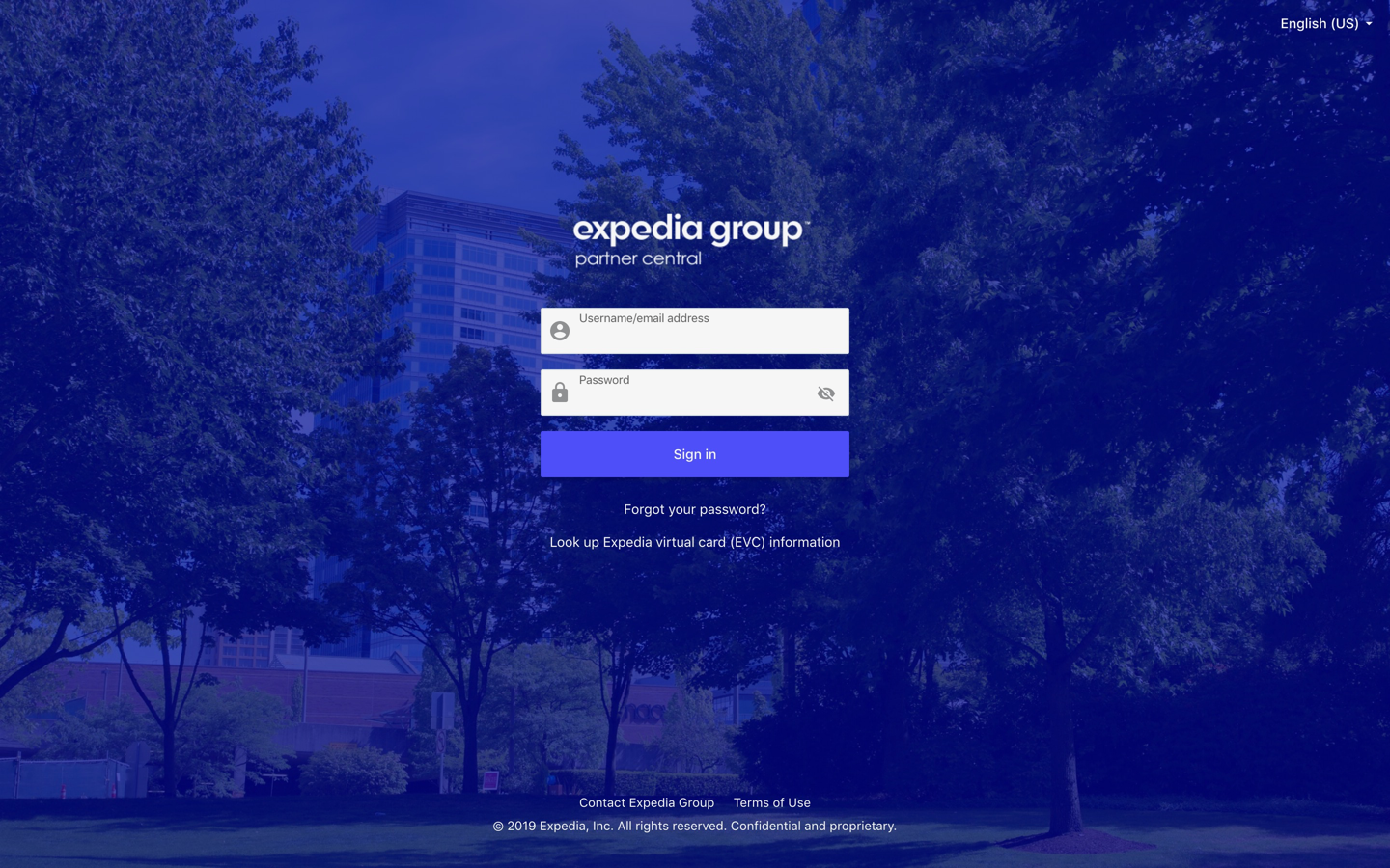
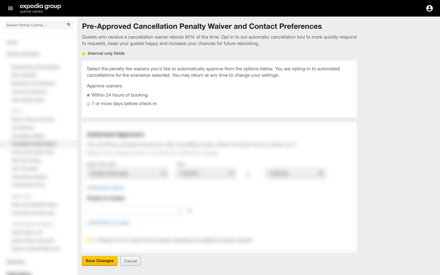
I also partnered with their design team to build the features in Partner Central platform (an application that provides self-service tools and information to help manage their business and maximize revenue potential). Now, the hotel partners can select the penalty fee waiver they’d like to automatically approve from the two available options:
- Within 24 hours of booking
- 7 or more days from check-in
Partner Central login page
Partner Central settings page used by hotel partners to configure the waiver rules. Blurred out rest of the sections for confidentiality reasons.
As we were working to complete this foundation work, I also worked to design and enable these features on our contact center agents application. Now, when the traveler will contact an agent for an in-penalty reservation and if the booking qualifies for free cancellation, agents will see the information right away on their screen and will cancel the booking + issue a full refund without asking any question.
No longer holding the traveler hostage to make an outbound call to hotels and get the waiver approved. It also made the process much more efficient by taking out the manual approval process to reduce operational cost and give time back to our hotel partners to ficus on running their business.
Agents application shows the new information. Due to confidentiality reasons, can't show the full UI.
Phase 2
Using the laid foundation
The second phase was to push the automated waiver functionality for travelers on the app and website. Instead of getting disappointed after realizing that they booked a non-refundable booking or missed the free cancellation period, it was more about delighting them that we went above and beyond to negotiate a free cancellation on their behalf.
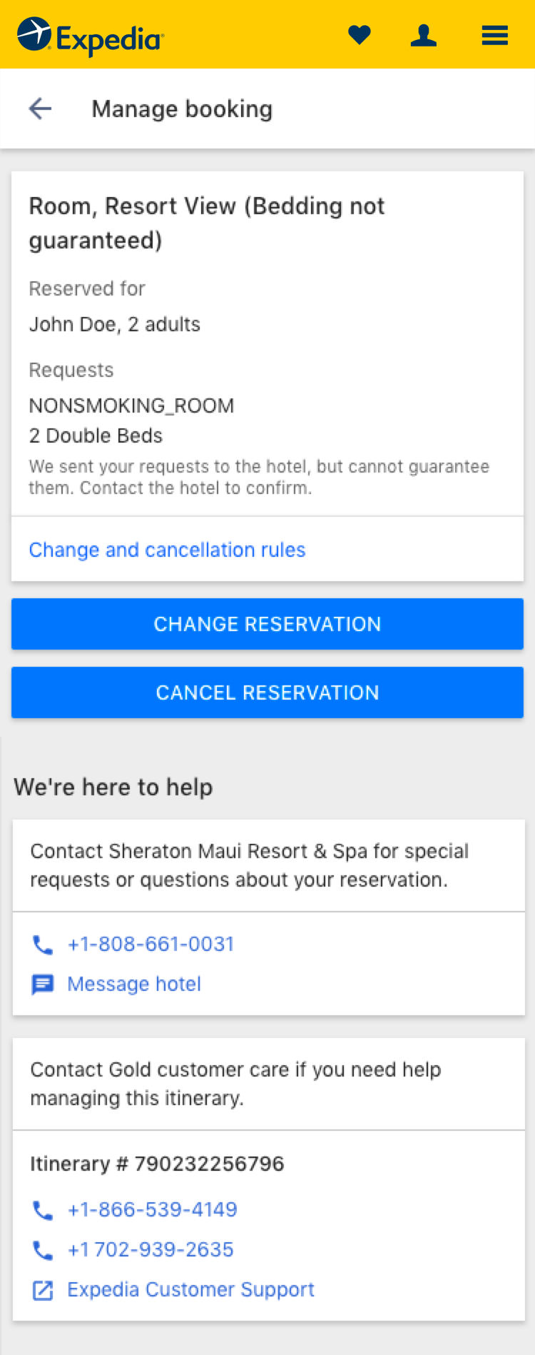
Since the feature can have an impact on a partner’s business, the riskier design decisions I made was to obfuscate the free cancellation information entirely on the itinerary page. The idea was to present the information after they click on cancel and register their intent, rather than upfront on the itinerary because knowing that information can persuade some users to cancel their trip.
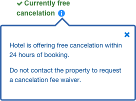
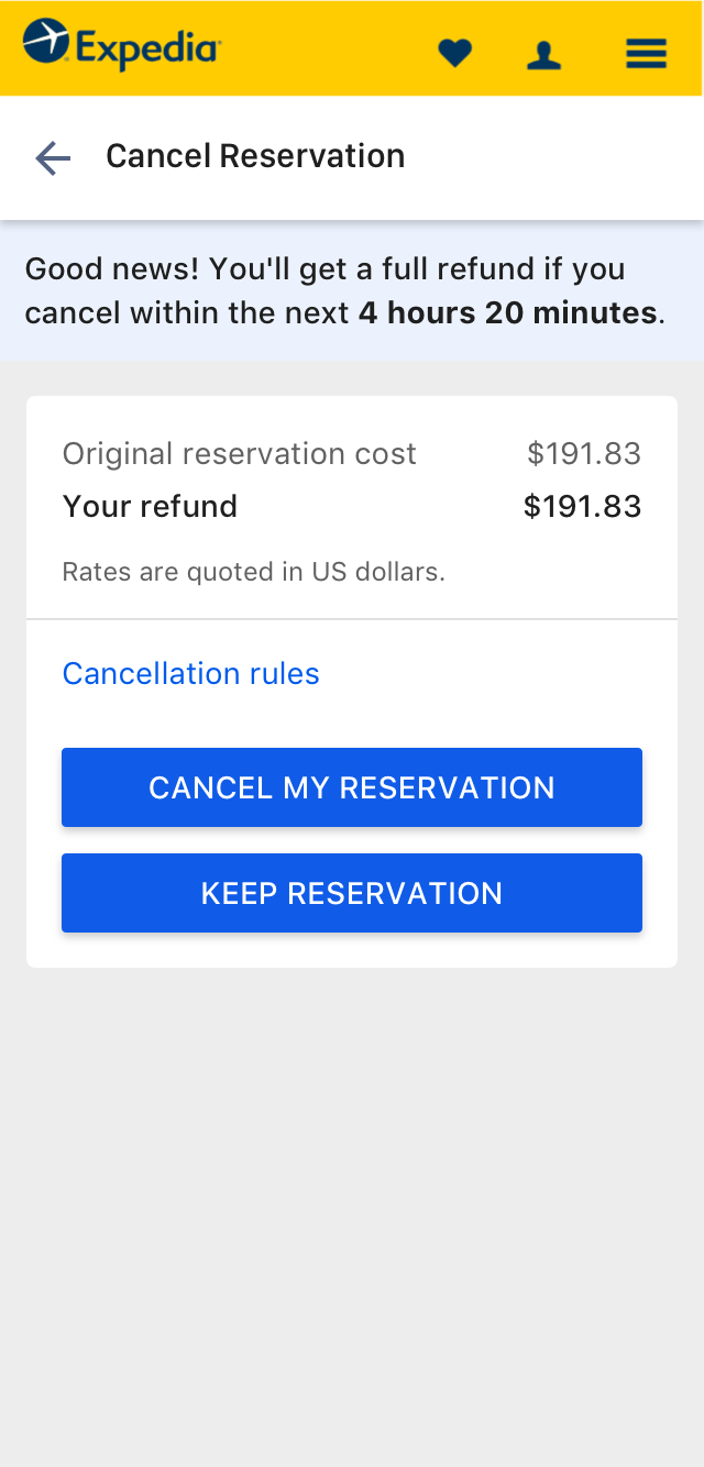
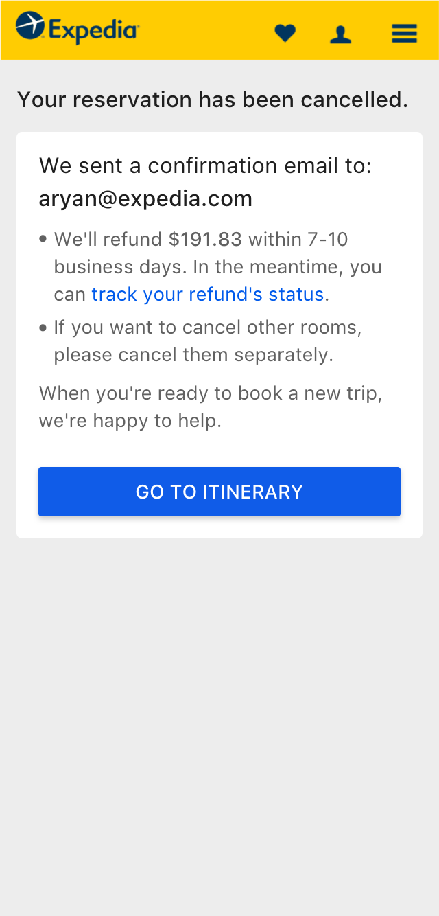
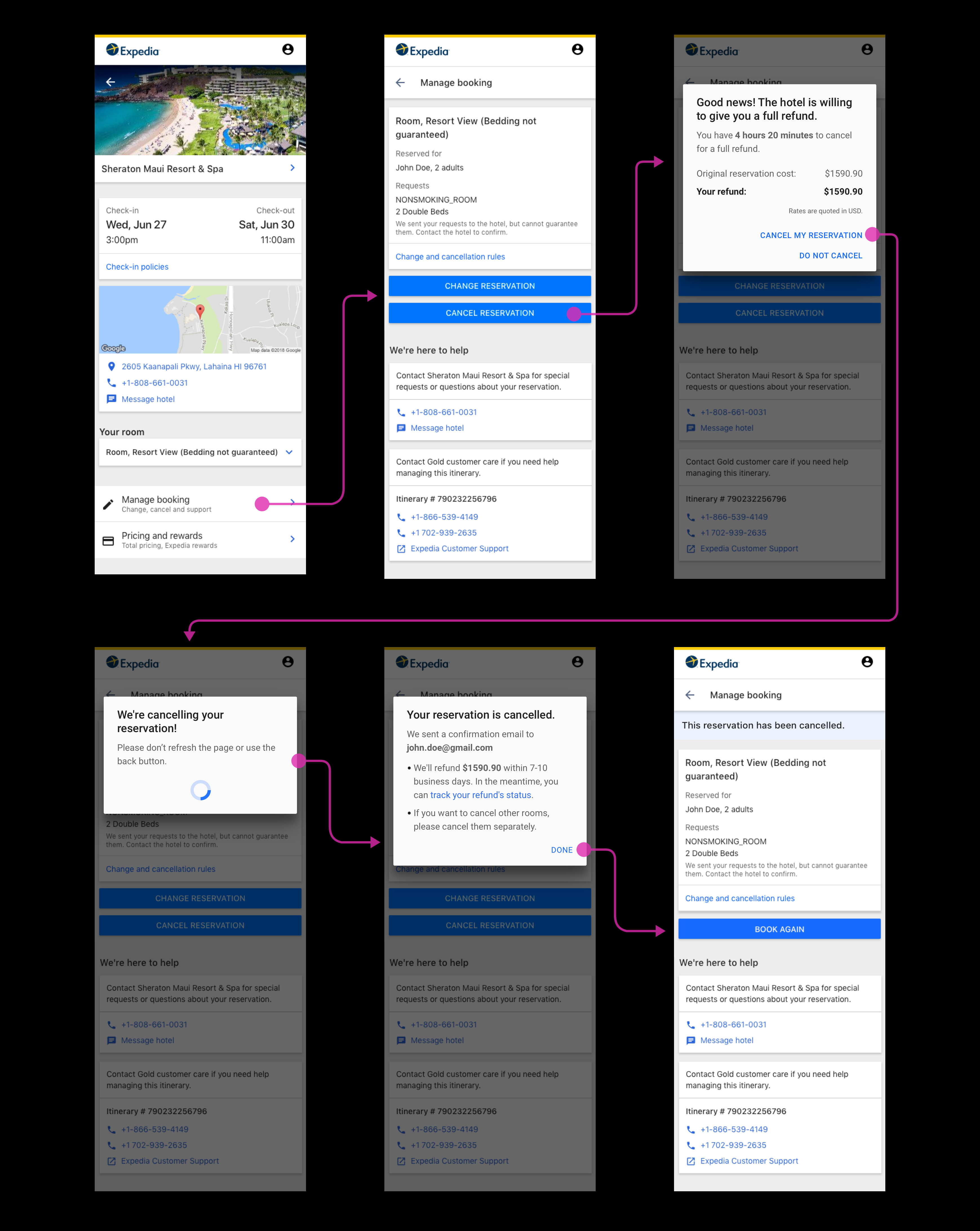
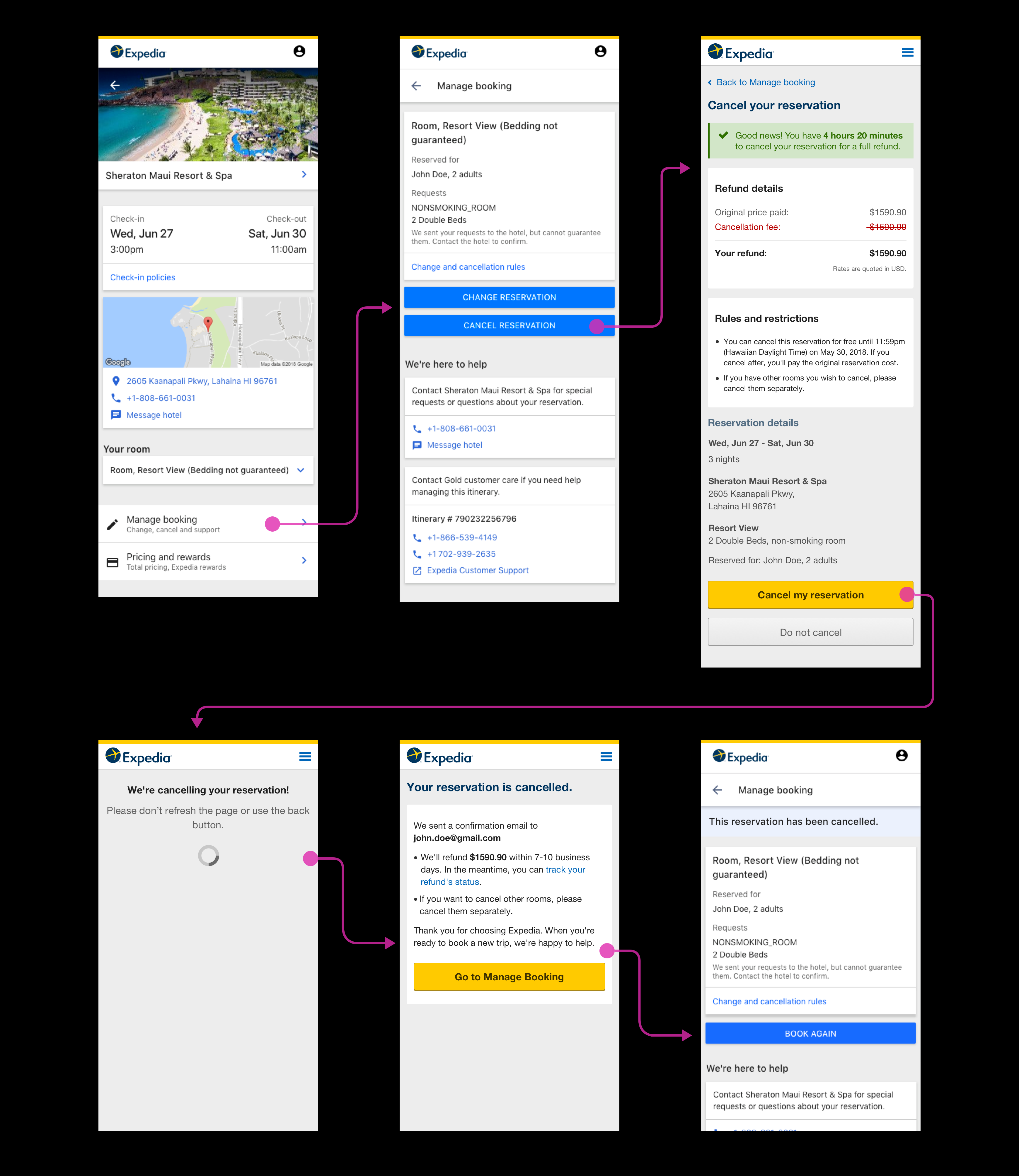
If a waiver is pre-approved by the hotel and if travelers cancellation timing falls in configured rule(s) scenario, then there will be a full refund immediately. A counter is also shown at the top of the page if the traveler wants to take some time to consult a traveling partner before making a decision. No more contacting an agent to get their booking canceled. After the reservation is canceled and the waiver is auto-approved, an email is sent to the hotel for confirmation and documentation purposes.
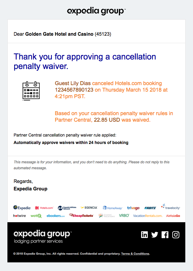
After a traveler cancels a reservation and gets a full refund an email is also triggered to the hotel for recordkeeping purposes.
Email sent to the hotel.
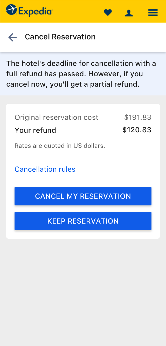
While enabling these features we also enabled cancellations of booking that fall outside the ‘No question asked’ window. The only way Travelers can cancel such bookings was by calling an agent. Now, if a user wants to cancel their trip by paying the cancellation fees they can cancel their booking online (More thought through customer-centric solution was planned in Phase 3).
Gauging the impact of the new flow
I wanted to test the two iterations of the new designs and also present a third option in front of the participants to get an early signal for the direction of Phase 3 designs. I partnered with Jeffrey Wong (Researcher) and conducted a remote moderated study using usertesting.com. We tested and got users’ feedback on general page layout, copy, messaging, etc. to decide on the best design to move forward with.
While building the new flows, we were also dealing with another challenge – Expedia.com was transitioning to a new design system and it was in an alpha stage. The iterations were done using two separate design systems because of some of those reasons.
High Level Findings:
Overall, participants thought the modal design was straightforward and easier to view than the page cancellation.
- All participants appreciated the time limit displayed to get a full refund.
- Participants were confused with the verbose rules and restrictions and wanted them to be short and to the point.
- In the page version:
- They expected to see the cancel button above the fold to instantly notice it.
- After seeing the timing message in green at the top and cancel button hidden below the fold, one participant misread and thought that cancel is already done.
- They would appreciate the refund pricing to be simple and the strike-through in red was making the information complicated to understand.
Phase 3
A new optimized process
The third phase came up when we started questioning whether there is an actual need for a Traveler to contact an agent for requesting a fee waiver for bookings that fall outside the ‘No question asked’ window or if the hotel partner has not configured the rules.
Rather than making the traveler contact an agent, the system will inform that there is a fee associated for canceling the booking and they can submit a waiver request to the hotel. The request will trigger an email to the hotel partner with an SLA of 48 hours. The hotel can take a look at the request including the reason for cancellation and will make a decision whether they want to waive the fee or not. The decision will be communicated to the traveler via their channel of choice like email, push notification, text message, etc.
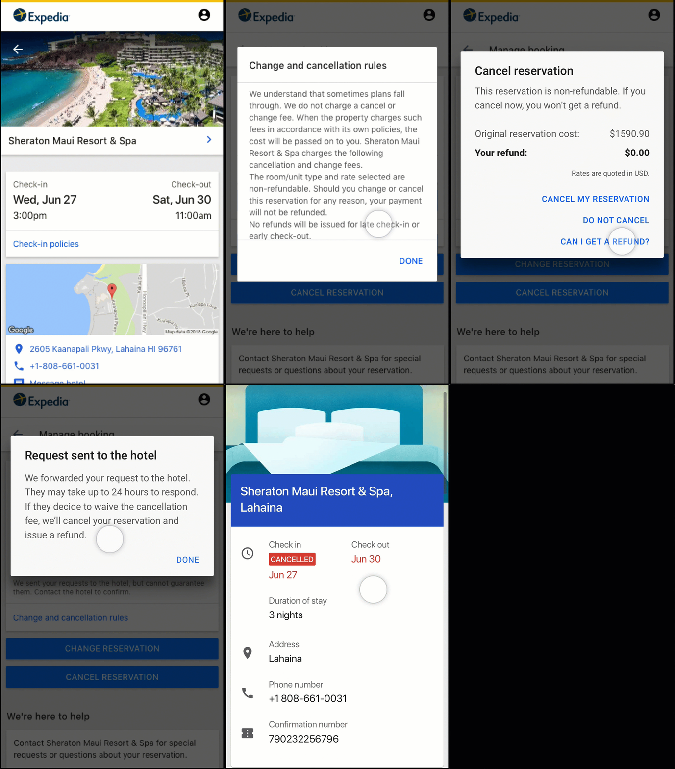
Requesting a waiver from the hotel.
This iteration was tested with participants with the previous Phase designs to get early feedback.
High Level Findings:
- None of the participants expected to see “Can I get a refund?” link and were delighted by it.
- 2/6 participants were confused by the “Request reduced fee” button because it sounded like they are getting fees reduced when the title of the modal says “Can I get a refund?"
Inspiring confidence while the request was in-process
If the new experience was to do the heavy lifting on behalf of the Traveler, the intermediate screen needed to inspire confidence and show clearly how the waiver request process was being taken care of.
To build trust and inspire confidence in the process, I designed the tracker feature that informs and shows the progress and also the approximate time to lower Traveler’s anxiety.
Knowing the cancellation timing, rules configuration and the reason for cancellation allowed us to do the heavy lifting and give the best route possible to our users. The system needed to be smart enough to just work when it could, and humble enough to suggest an alternate route when it couldn’t. For example, if the booking is too close to check-in like 48 hours away, the traveler needs to contact an agent for cancellation as that is the fastest and most reliable route to get a waiver of the fee.
A new direction
At the same time, there was also a shift at Expedia Group to think more in terms of Platform rather than Product and to emerge as The World’s Travel Platform. My organization was making a big bet on the virtual agent platform that can do all the heavy lifting in self-service and customer service space for our travelers. We made a pivot to build all this functionality using chat and voice bots which were more scalable as a business. I worked with Emma Wang (Designer) and Dave Park (Product Manager) to lay down the strategy and flows in the new space. This required a big design shift for the posture of the experience. The challenge was shifting from traditional web pages to a conversational interface. Instead of designing for a particular brand, we designed a flexible system optimized for configurability and scalability.
The project is being actively developed and I can't reveal much until it goes live. Will update the study shortly after release.
Read more about the virtual agent platform case study.
The Impact
Positive results
The redesign of the cancel experience has had a positive impact on travelers, partners, and agents at the time of writing. However, partner adoption has not been significantly increased which means there are hotel partners that have not configured the rules yet and the agents continue to contact them for waiver requests. I believe this will improve over a longer period of time as we invest more in relaying the benefits of the change and also surface the rule configurability feature above in the hierarchy on the Partner Central UI.
Next Project
Project Preview + Case Study

